One of the most common frustrations we hear from Houston businesses is about mismatched promo colors on branded items. The problem isn’t your printer—it’s the lack of a standardized color language.
That’s where understanding the Pantone Matching System is important. In this post, we’ll break down what PMS is, why it matters, and how Alpha Imprint helps apply it to hit promotional products. Whether you’re reordering materials or launching a new campaign, you’ll leave with clear steps to protect your visual identity across all promotional products Houston.
Why Is Brand Consistency Important?
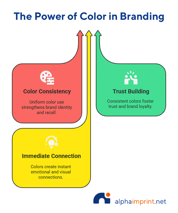
Consistency in color across your brand’s materials does more than please the eye—it builds trust. Think about how Coca‑Cola’s red or Tiffany’s blue evokes an immediate connection. That’s no accident. These colors are applied everywhere they want their identity to show, and at the same time, they shape how people remember them.
Studies consistently show that a consistent visual identity makes consumers more likely to notice, remember, and trust a company. When your color palette is remembered across platforms and communicates a message, people are more inclined to choose your brand again. This matters when distributing promotional products in Houston, because local audiences especially respond to polished, unified experiences. Whether it’s at a trade show, pop-up event, or inside a customer’s swag kit, your items need to match your business cards and website for maximum impact.
Hit promotional products like branded promotional water bottles, polos, branded notebooks, and packaging all shine brighter with exact brand hues. That’s why brand consistency isn’t just a design rule—it’s a trust‑builder. When your business cards, signage, and promotional products all match seamlessly, you’re telling your audience that you care about detail, quality, and professionalism.
For Alpha Imprint, it’s about more than color—it’s about reinforcing your reliability, every time your logo appears. We help businesses look professional in every aspect, advising them to include their Pantone values in their order to apply them to every item that goes through the production process.
What Is the Pantone Matching System?
PMS is essentially a universal language for color. Think of it as a shared reference library, where each color gets a unique code, like ”PMS 186 C” (a bold red). When you share that code with a supplier, everyone, including the designer, printer, and manufacturer, knows exactly which shade you mean, no guesswork required.
Picture this: you order a series of promotional products in Houston, you provide the file of your logo, and it uses a deep forest-green color. You order a large order of custom T-shirts, matching tote bags, and glossy ceramic mugs. But when they arrive, the shades and colors look completely different. That’s a problem the Pantone Matching System (PMS) solves.
Pantone differs significantly from CMYK or RGB systems, which can shift depending on screens, printers, or fabric types. With PMS, your logo’s colors stay true across print, embroidery, and even laser-etched gear. That consistency is crucial when you’re investing in hit promotional products like water bottles or notebooks; mismatched tones can dilute the effect.
At Alpha Imprint, using PMS is part of our standard process. We match your brand’s Pantone codes across a wide range of 250,000+ items, so the green on your T-shirt is the same rich hue seen on your tote and mug. And if you don’t have the Pantone codes on hand and you need your promotional products fast, don’t worry. We always try to get closest to the colors and references our customers provide, making sure you always receive your products as you envisioned.
How to Use the Pantone Matching System?
When you’re serious about keeping your brand colors consistent for promotional products in Houston, Pantone makes it possible. Here’s how to weave it into your brand workflow step by step:
1. Start with Your Brand Guidelines
Pull together a document where you show how your primary and secondary colors look with their exact Pantone codes. These color references are the backbone of your visual identity.
2. Share Those Codes with Your Vendor
Send your Pantone color list to your supplier (Alpha Imprint, for example) and confirm they use the same system. Don’t risk it; a single mismatch in codes can change your color entirely.
3. Ask for Color Proofs
Before placing a big order, request physical samples. Or, if you are too far, ask for a physical photo of a printing test before it goes into full production. Printing on fabrics, metal, or plastic can shift color slightly, so if you want to make sure everything goes perfectly, we will be happy to provide a real sample to make sure it matches your expectations.
4. Keep Detailed Records
Save all your Pantone codes, proofs, and any vendor comments. Document it and share this information with everyone in your marketing, design, and production team. Everyone involved in your company needs to be working from the same branding book.

Quick tips from Alpha Imprint you might want to remember:
Know the difference between Coated (C) vs Uncoated (U) when printing [promotional signage], brochures, and other paper materials.
- Coated paper has a smooth, glossy texture that makes colors seem more brilliant and saturated.
- Uncoated paper is more porous and absorbs more ink, giving it a more subdued color and natural appearance.
- Ink mixing needs: Some Pantone colors require special mixes. Let your vendor know or provide your brand guidelines upfront to prevent last-minute surprises.
How to Apply It to Promotional Products
Colors look different depending on where they’re applied. A logo that pops on a t-shirt in your digital mockup can appear dull or off-tone on a mug or embroidered tote. That’s where the Pantone Matching System becomes essential for promotional products in Houston—it ensures consistency from fabric to ceramic, from screen-print to laser etch.
Ideal Items for PMS Precision
Some items simply demand accurate color matching. Here are great examples where PMS is a game-changer:
- T-shirts, polos, and hats
- Mugs, tumblers, and glassware
- Pens, notebooks, and lanyards
- Tote bags, tech sleeves, and packaging
- USB drives, personalized wireless chargers, and other accessories
They also work like hit promotional products that travel as far as your customers and workers go, sit on their desks, and often live in their homes, so they need to reflect your brand properly.
Alpha Imprint’s Color-Truth Sequence
At Alpha Imprint, color consistency is always top of mind. Here’s how we make sure your branded products look right from first glance:
Design support — We review your Pantone codes and suggest proper application methods.
Proofs when needed — For large or mixed-media runs, we provide physical samples before full production.
Extensive catalog — With over 250,000 items ready for PMS use, you’ll find the perfect product every time.
Real Example:
A local real estate firm needed navy blue hats and coffee tumblers that featured PMS 281 C in their logo. By sharing the Pantone code with us early, we matched the navy exactly—whether embroidered on fabric or printed on ceramic—giving the client a polished, coordinated look across every item.
That’s why your branding needs to be consistent in every medium. Custom embroidery, screen printing, and laser etching—they all react differently to inks and materials. But when you specify a Pantone color in your design file, each process aims for that same reference. That’s how your logo maintains its impact and integrity—no matter how it’s printed or stitched.
Conclusion
One of the biggest mistakes in promotional marketing is assuming every printer or vendor interprets your colors the same way. Brand color inconsistencies might seem minor, but when a customer receives a mug in one shade of blue and a tote in another, it signals a lack of attention to detail, even if the logo is right.
By applying what you’ve learned in this article, you can keep your brand looking sharp across every touchpoint. From custom embroidered polos to printed notepads, understanding Pantone Matching for Houston Brands Consistency makes all the difference.
That’s how businesses in Houston are elevating their branding game—and you can do it too. With Alpha Imprint’s design support and extensive catalog of promotional products in Houston, you’ll never have to worry about color guesswork again.
Contact Alpha Imprint today and let our team guide you through our PMS-matched items!
Want perfect color alignment in your branding? You might also like: Designing Logo Colors That Pop on Dark Promo Items