The best colors for yard signs should do three things well: stand out, stay readable, and match the message.
Choosing the best colors for yard signs isn’t just a cosmetic decision; it’s a strategic one. If the colors are chosen correctly, the sign will be easier to see and read and have a stronger psychological impact.
In this guide, we’ll look at colors, effective combinations, and their real-world applications in yard signs.
After reading this guide, feel free to explore our signage catalog. We offer affordable signage in Houston, carefully designed with quality in mind.
Best Colors For Yard Signs (Quick Answer!)
| Goal / Use Case | Best Colors | Why It Works | Pair With (Text/Accent) |
|---|---|---|---|
| Maximum attention | Red, Yellow | Highly visible, grabs attention fast | White (for red), Black (for yellow) |
| Trust / professional | Blue | Calm, reliable, widely accepted | White |
| Premium / bold | Black | Strong contrast, authoritative | White or Yellow |
| Clean / simple | White | Minimal, clear base | Black or Blue |
| Eco / natural | Green | Matches nature, calming | White (ensure contrast) |
| Urban / high-noise | Orange, Neon | Cuts through visual clutter | Black |
Why Choosing the Right Colors for Yard Signs Matters
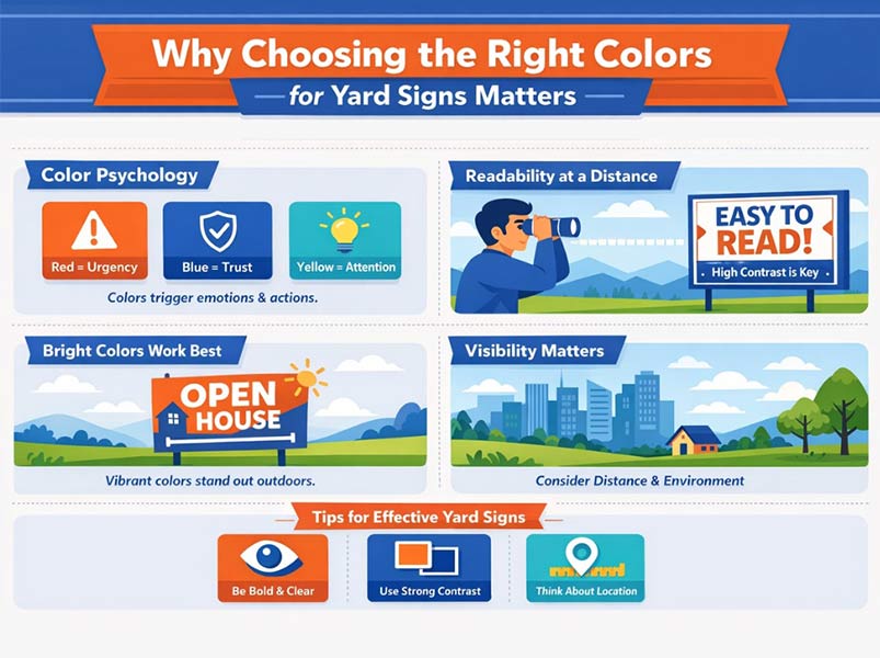
The Role of Color Psychology in Sign Effectiveness
Among all types of signs, color psychology becomes especially important for yard signs, because they are supposed to capture attention from a distance.
Color on a yard sign isn’t just about looking pretty; it also affects how people react. In terms of emotional impact, red typically conveys urgency and movement, blue conveys trust and stability, and yellow grabs attention quickly.
That’s why a quick sale sign, a local services sign, and an election sign don’t necessarily have to share the same color. The right color will push the message into the reader’s mind before they’ve even read it.
Visibility and Readability: The Real Performance Drivers
In yard signs, what really counts isn’t just attractive color; it’s readability from a distance. Readable yard signs typically rely on high contrast: light text on a dark background, or dark text on a light background.
The W3C also emphasizes that readability is more about light-dark contrast than hue itself.
Outdoors, sunlight, grass color, tree shade, and viewing distance all affect color choices.
For this reason, high-contrast signage, such as black-on-yellow or white-on-dark-blue, is usually safer and more practical.
Best Colors for Yard Signs (Complete Breakdown)
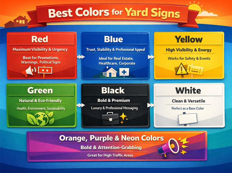
Red – Maximum Visibility and Urgency
Red yard signs are very visible outdoors, especially on grass, dirt, or neutral backgrounds. They work well for promotions, warnings, and some political messages, as they are attention-grabbing colors. Just be careful, as they can look harsh and even boring when overused.
Blue – Trust, Stability, and Professional Appeal
Blue yard signs are best for messages that convey reassurance. It’s a safe choice for real estate, healthcare, more relaxed campaigns, and local services.
Among professional signage colors, blue is often seen as both professional and calming and stable.
When combined with white text or light accents, it looks very clean and trustworthy outdoors.
Yellow – High Visibility and Energy
Yellow yard signs are one of those colors that stand out very quickly in daylight. They’re a great choice for events, safety messages, and signs that need to be seen from a distance.
Among high-visibility signs, yellow usually works best when paired with dark text, such as black or navy; otherwise, it can be too bright and hard to read.
Green – Natural and Eco-Friendly Messaging
Green yard signs look very natural and harmonious for messages related to nature, health, landscaping, or sustainability.
Among natural branding colors, green conveys growth and tranquility.
There is just one caveat: if it blends in with the surrounding grass or greenery, the message can get lost. So, contrast is more important than the color itself.
Black – Bold, Premium, and Highly Readable
Black yard signs look very solid and professional when combined with white or yellow text. For high-contrast signage, black is one of the safest choices because it keeps the message clear.
For some brands, service businesses, or luxury sign colors, black conveys authority and elegance without cluttering the design.
White – Clean, Minimal, and Versatile
White yard signs usually serve as a good base. For clean signage design, white helps the text and accent color stand out more clearly.
It works great for community signs, event signs, or simple service signs, as it creates a sense of cleanliness and clarity. Just be careful not to use glare or a background that is too bright, as it can make the sign look too dull.
Orange, Purple & Neon Colors – Bold and Attention-Grabbing
For busy streets, noisy intersections, or short-term events, neon yard sign colors and other bold signage colors sometimes work better than classic colors.
Orange and neon are very visible, and purple, when used correctly, feels different and bold. These unique sign colors are most common in urban environments.
Best Color Combinations for Yard Signs
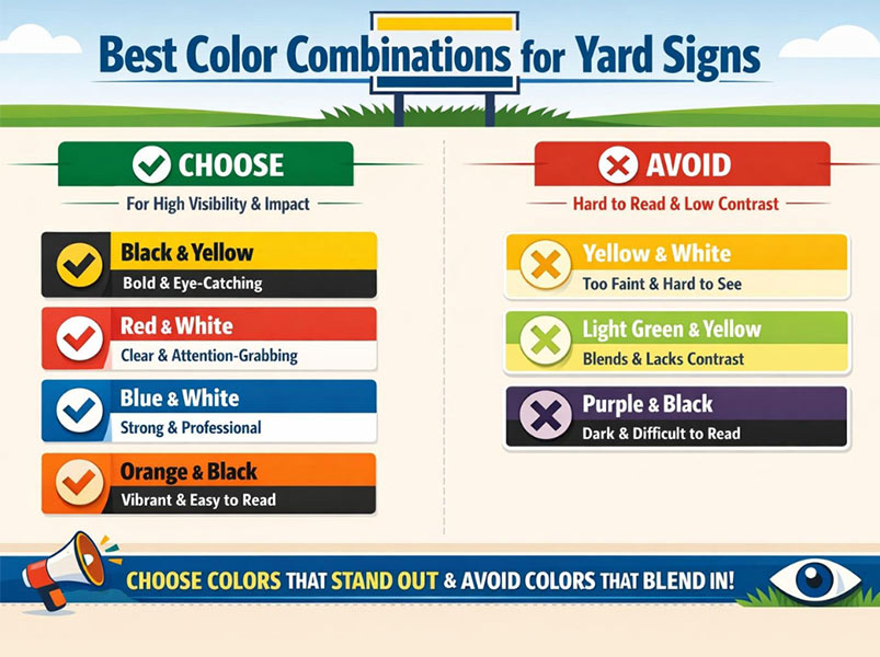
High-Contrast Combinations That Work Best
When it comes to the best color combinations for yard signs, the winners are usually the ones that are easy to read from a distance.
Black + Yellow is one of the strongest and works well for urgent messages or service signs.
Red + White grabs attention quickly and is perfect for promo or political-style messaging.
Blue + White looks clean, professional, and trustworthy.
Orange and Black are also a contrasting color combination that stands out against the background in busy urban environments.
Color Combinations to Avoid
Some combinations don’t look bad on a monitor, but they really work poorly outdoors. Yellow and White are usually so bright that they wash out the message.
Light Green + Yellow is also very easy to get lost in an outdoor space, especially next to grass and daylight.
Purple + Black also has low visibility and is not readable from a distance if the shades are not chosen correctly. The simple rule is: if the text and background cannot be seen separately, that combination is not suitable for a yard sign, even if it looks stylish up closely.
How to Choose the Best Colors for Your Yard Sign
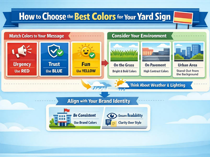
Match Colors to Your Message and Goal
When choosing yard sign colors, first ask yourself: How will people react to this sign? If the message is urgent, red is a stronger choice.
If your aim is to inspire confidence, blue remains the more dependable choice. If the mood should feel welcoming, lively, or celebratory, yellow tends to perform best. This is the most straightforward principle in signage color strategy: “define the intent first, then select the color.”
Consider Your Environment, Placement, and Type of Yard Sign
A good color in the wrong place can still yield poor results. If the sign is going to go on grass, a green background is a dangerous choice.
Next to pavement, a parking lot, or a busy street, contrast becomes even more important. Sunlight, tree shadows, rain, and glare also affect visibility.
When choosing yard sign colors, always consider the installation location, viewing distance, and lighting conditions before printing.
In addition, consider that not all colors look good on different types of yard signs. While some shades may appear eye-catching on screen, they may look dull or washed out depending on yard sign materials like corrugated plastic or reflective surfaces, that work differently with light and color.
Align with Your Brand Identity
In branding and signage, consistency is important, but not at any cost. If your brand color is beautiful but not legible from a distance, choose a more readable version for your yard sign.
The best signage color strategy is to prioritize readability, then maintain the brand identity within that framework. That is, consistency is important, but not at the expense of the message.
Work With a Professional Partner
At Alpha Imprint, we know what it takes to create effective signage. After over four years of delivering reliable signage services in Houston and beyond, our team is ready to design eye-catching yard signs in Houston for you that help your business generate more leads.
Conclusion
Ultimately, the best colors for yard signs aren’t just about looking pretty; they need to be visible from a distance, easy to read, and convey the right message.
Color selection becomes much more accurate when you consider good contrast, the installation environment, and the message’s intent. It’s often this combination of readability, visibility, and psychology that makes a sign truly effective.
FAQs
What are the best colors for yard signs?
Red, blue, yellow, black, and white are usually the best choices because they are both visible and easy to read.
What color combinations work best for yard signs?
Combinations like black + yellow, blue + white, red + white, and orange + black are usually best seen from a distance.
What color is most visible from a distance?
Yellow is usually the most visible, but in practice, a color with higher contrast against the background is better.
How many colors should a yard sign have?
Usually, two or three colors are enough. If there are too many colors, the sign becomes crowded, and the message becomes harder to read.
Are bright colors always better?
Not always. If a bright color lacks sufficient contrast, it may not be easily read, even though it attracts attention.