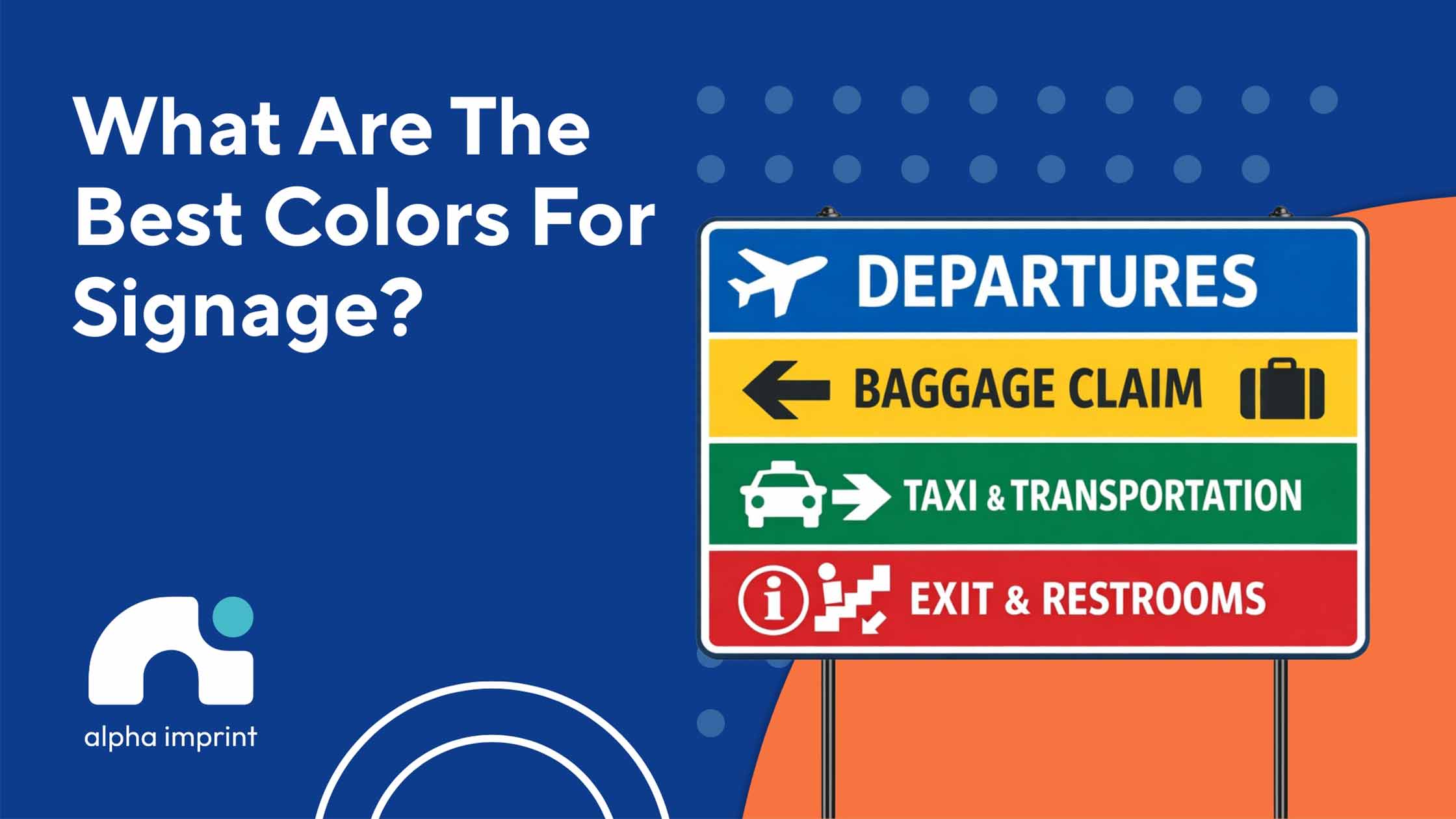
Most people think sign color is just about style, but it can also shape visibility and first impressions.
Choosing a signage color is one of the most important parts of a sign’s visibility and impact. Color can affect attention, audience feelings, and initial impression. If the best color for signs is chosen correctly, both legibility and brand memorability improve.
In this guide, we will look at the attention-grabbing colors and the best color combinations for signs. As a company that specializes in signage Houston businesses trust and beyond, we know which colors work best for different businesses.
Why Sign Color Matters in Signage Design
The Role of Color in Visual Communication
In visual communication signage, color is the first thing people see before the text. If the signage color doesn’t contrast well with the background, even the best message won’t be read.
The W3C also emphasizes that higher light contrast improves readability for people with low vision and even those with color vision deficiency.
Therefore, branding colors are effective when they both maintain brand identity and provide clarity and quick recognition in real-world settings, such as busy streets or shopping centers.
This is where sign color directly impacts first impressions, message clarity, and the marketing impact of signage.
How Colors Influence Customer Behavior
From a marketing color psychology perspective, colors can direct the type of audience response, but not magically, and not the same for everyone.
Research studies show that red typically has an attention-grabbing advantage and, in warning contexts, more quickly activates a sense of urgency and caution.
Blue is more closely tied to trust and quality appraisal in store and company evaluations, whereas yellow, in warning-sign studies, typically heightens attention and the perception of danger.
So, in color psychology for signage, the best choice depends on the signage color meaning and its purpose: to attract quickly, convey trust, or prompt an immediate decision.
Now that you know how important sign colors are, you also need to understand that the best color varies for different types of signs and businesses. Moving forward, we will present the top choices and explain which purpose each one serves best.
Signage Color Meaning: What Different Colors Represent
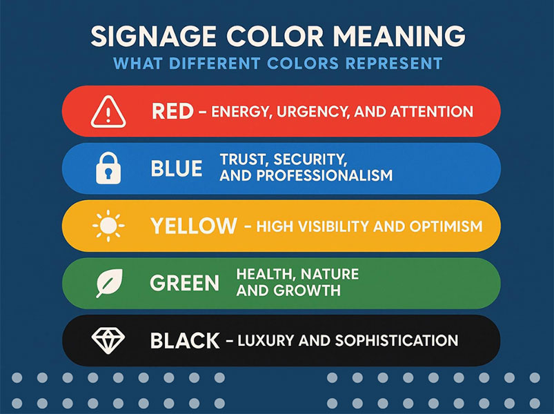
Red – Energy, Urgency, and Attention
Red is one of the attention-grabbing sign colors that are usually noticed more quickly. It works well in promotions, restaurants, and retail sales, as it increases the sense of action, urgency, and energy.
However, while red is one of the best colors for signs, if used too much, it can also seem aggressive or boring.
Blue – Trust, Security, and Professionalism
Blue signage color is good for spaces that need to convey trust. For this reason, it is often seen among banks, tech brands, and even healthcare. Research has also shown that blue is more associated with trust, quality, and professionalism in brand evaluations.
Yellow – High Visibility and Optimism
Yellow is one of the best colors for sign visibility, especially when it needs to be seen from a distance. In studies of warning signs, yellow backgrounds have generally been rated as more legible and more alerting than blue backgrounds.
Yellow conveys optimism and is considered an eye-catching color.
Green – Health, Nature, and Growth
Green signage color is often a good choice for eco brands, organic stores, and sustainability messages. New research shows that green labels and elements can more effectively convey healthfulness and eco-friendliness.
That’s why green works so well for eco-business signage and natural branding colors.
Black – Luxury and Sophistication
Black signage color quickly feels premium and controlled when paired with good contrast, like white, gold, or silver. New research also shows that black is more closely associated with perceived premium quality and luxury branding colors than many other colors.
Black is one of the best colors for signs that represent luxury brands, it’s a safe and stylish choice.
What Colors Are Eye-Catching and Draw the Most Attention?
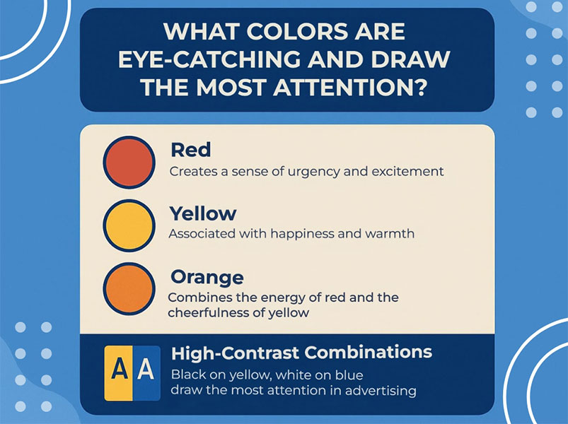
A color stands out most when it has strong contrast, brightness, and is clearly separated from nearby colors. This means that a color’s visibility depends more on its contrast and context than on the color alone.
Colors That Attract People the Most
To put it very practically, red, yellow, and orange tend to attract people, but it’s not just about excitement. In visual search studies, some yellow targets have been found faster than blue ones, and in memory studies, red and yellow objects have been remembered better.
However, attention-grabbing colors really work when they’re paired with high-contrast combinations like black–white or red–black. So, the real answer to what colors are eye-catching is: distinctive color, not just sharp color.
What Colors Draw the Most Attention in Advertising
In advertising colors, the winning color usually comes from the message’s purpose.
Red and yellow are common in fast food and promos because they’re warm, immediate, and energetic; orange works well for offers and callouts; bright blue also lends a sense of cleanliness and confidence to tech and service brands.
But the important thing is that the colors that draw the most attention always change with context: the size of the color surface, its place in the scene, and the audience’s familiarity with the brand directly impact recall and engagement.
That’s why the best eye-catching signage colors are always category and background-dependent, not a fixed formula.
Best Colors for Sign Visibility
Why Contrast Matters for Readability
The reason color contrast is important is simple: people don’t read signs like they do a book. Most of the time, they’re either walking by, passing by, or only looking at it for a few seconds.
If the text and background are too close together, the message gets lost.
That’s why readable signage colors often go for combinations like black on yellow, white on blue, and white on black. These high-contrast sign colors are both easier to see and easier to read.
Best Color Combinations for Signs
If we were to name a few surefire combinations, these are usually the best: 1) black on yellow, 2) white on black, 3) white on blue, 4) red on white, and 5) yellow on black.
Each one has a simple reason; they either create great contrast, make text look cleaner, or are better seen from a distance.
For this reason, these sign color combinations are popular with many brands and are still considered among the best colors for signs and the most practical signage color combinations.
What Colors Represent Success in Business Signage
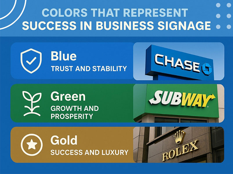
In business signage colors, some colors convey a sense of status and power at first glance. If someone asks what colors represent success, the answer is usually not just one color.
Success comes more from the combination of color and brand positioning; that is, the color should create the image you want people to remember about your business.
Colors Associated with Success and Growth
Among successful brand colors, blue usually conveys stability and trust, green is more closely associated with growth and progress, and gold conveys value and prestige.
When used correctly, these colors don’t just make a sign look good; they help your brand appear more professional, confident, and successful.
How to Choose the Best Sign Colors?
Factors to Consider When Selecting Sign Colors
To find the best color for signage, do not begin with the hue itself; instead, anchor your thinking in the tangible context, “where intention meets perception.” First, reflect on your brand’s character and the emotional resonance it is meant to evoke.
Then, think about your audience: a sign that’s right for a clinic won’t necessarily work for a fast-food restaurant.
The location is also important: is it indoors or outdoors? Is it daylight or does it need to be visible at night? Will people see it from the front or as they pass by?
This is where the signage color strategy comes into play. If a color looks good on a monitor but is dull on the actual material, it’s not the right choice. That’s why it’s always best to test a printed sample or a real mockup before committing to a final implementation.
Common Sign Color Mistakes to Avoid
Design Errors That Reduce Sign Visibility
One common mistake is choosing colors that are too similar, such as text that nearly matches the background.
Using too many colors can also make a sign confusing instead of grabbing attention.
Lighting is important too, because a color that looks good indoors might not look as good in sunlight or at night.
Another problem is choosing sign colors that blend in with the surroundings, which can make the sign hard to notice.
Conclusion
The best colors for signs don’t just make a sign look better; they also make them more effective. Good signage color should align with the brand identity, be visible from a distance, and not compromise readability.
When these three things are together, the sign will both attract more attention and look more professional.
FAQs
What is the best color for a sign?
The best sign color depends on your brand, location, and contrast. In many cases, high-contrast combinations are the most readable.
What is the 3-color rule?
The 3-color rule means using one main color, one support color, and one accent color to keep signage colors clean.
What color sign gets the most attention?
Red, yellow, and orange usually catch the eye fastest, but the most attention often comes from strong contrast, not color alone.
Which color gives a rich look?
Black, gold, and deep navy often create a rich look. These are some of the best colors for premium-brand signs.
What color attracts the most energy?
Red usually feels the most energetic because it looks bold, urgent, and active. It works well when you want fast attention.
Which color is the sign of success?
Blue, green, and gold are often linked with success. The right color for the sign depends on whether you want trust, growth, or prestige.
What colors are most visible from a distance?
Yellow on black, black on yellow, white on blue, and white on black are among the most visible signage color combinations.