All hat fonts look good on a monitor; the problem starts when they are sewn onto the hat’s curved surface.
Not every font that looks good on a monitor will necessarily stitch well on a hat. The curved surface of a hat, limited design space, and the need for legibility make selecting hat fonts more sensitive.
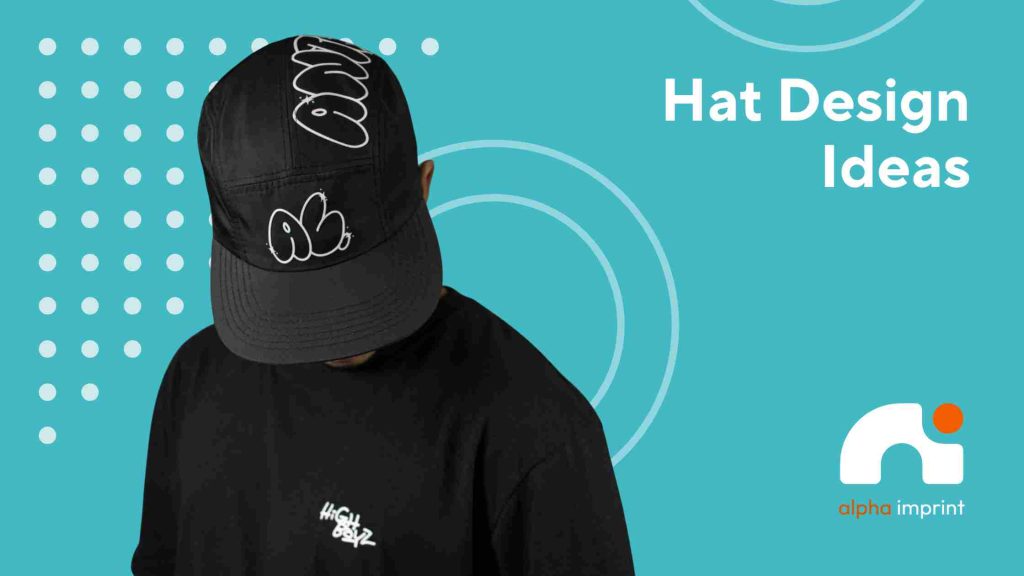
In this article, we will explore 4 best fonts for hat embroidery so that the final design is both beautiful and cleanly stitched.
Best 4 Hat Fonts at a Glance
- Bold Black Fonts
- Clean Sans Serif Fonts
- Simple Script Fonts
- Vintage & Varsity Fonts
Alpha Imprint; Trusted Local Partner for Custom Hat Embroidery in Houston
Local Support for Branded, Promotional, and Custom Hats
Custom caps in Houston and embroidered hats for restaurants, teams, companies, local events, and branding campaigns are not just accessories; they are part of a brand’s visibility.
At Alpha Imprint, we help you select the hat style, thread color, logo placement, and font so that the stitching remains clean and legible.
Whether you need embroidery in Houston or promotional products in Houston for uniforms, giveaways, corporate events, or merch, our local team makes the choice easy.
What Makes Hat Fonts Embroidery-Friendly?
Readability, Thickness, and Spacing
The best hat fonts don’t just look good on screen; they also need to be legible after stitching.
Embroidered letters need to be thick enough to allow clean thread to sit on the fabric. Too little spacing between letters can cause words to stick after stitching.
For this reason, embroidery-friendly fonts are usually medium-to-bold. When choosing the best fonts for hats, consider the hat material, front panel shape, design size, font spacing and stitch density.
For more general choices, the best fonts for embroidery guide also help.
Why Some Digital Fonts Fail on Hats
Some embroidery fonts for hats look clean on a monitor, but their detail is lost on a curved hat surface.
Very small letters, thin lines, delicate flourishes and tight spacing usually don’t produce clean stitch output.
Best 4 Hat Fonts for Embroidery
Choosing the best font for hat embroidery means finding one that looks clean, legible, and stitchable on the hat’s curved surface.
Some fonts are good for small logos, some for 3D puffs and some are more suited to merch, teams or streetwear brands.
1. Bold Block Fonts
Bold block fonts are usually the safest choice among embroidery fonts for hats. The thick letters, clear spacing, and simple form make company names, team names, school hats and uniforms readable from a distance.
They’re also great for 3D puff embroidery, as the thick strokes hold the embossed form better. If legibility and a professional look are your goals, block fonts are usually the go-to choice.
2. Clean Sans Serif Fonts
Clean sans serif fonts have a modern, simple and neat look. This group is considered a modern embroidery fonts and is a good choice for tech brands, service businesses, minimal logos and everyday promotional hats.
The clean edges and wide spacing help prevent the letters from sticking together after stitching. For brands that don’t want a busy look, these are the best fonts for hats.
3. Simple Script Fonts
Simple script fonts give a hat a more personal, subtle and unique feel. They’re an attractive choice for boutiques, lifestyle brands and custom embroidered hats.
However, scripts that are too thin, convoluted or compressed on a hat quickly become illegible. It’s better to choose simple, slightly thick and well-spaced scripts.
4. Vintage and Varsity Fonts
Vintage embroidery fonts and varsity fonts are great for baseball caps, college-style hats, merch drops and streetwear hats.
These fonts create a sporty, nostalgic, and bold feel.
Just make sure the letters are bold and don’t have too many tiny or distressed textures, as small details won’t show up in clean stitching.
Mistakes to Avoid When Choosing Embroidery Fonts for Hats
Thin Lines, Tiny Letters, and Too Many Details
One of the most important embroidery design tips for hats is to not choose a font that is too thin. Small letters, large words, tight spacing, and low-contrast threads will make the text unreadable after stitching.
Because there isn’t much space on a hat, using clean initials or a short word usually looks better than trying to fit in a long sentence.
It’s nice to see embroidery ideas, but keep in mind the final font should be checked with a stitch test before production.
Conclusion
The best choice for hat font is one that balances style and stitch quality. For most hats, bold block, clean sans serif, simple script, and vintage/varsity fonts are safe options.
If you are looking for the best font for hat embroidery and a professional execution, Alpha Imprint can help you choose the font, logo placement, and hat embroidery.
FAQs
What font looks good in all caps?
Bold block fonts and clean sans serifs usually look best in all caps, as they have greater thickness, spacing and legibility.
What is the best font for hats?
Bold, simple, and minimal fonts are usually the best choice; especially for logos, initials, team names, or business brands.
What size font for hats?
For text on hats, it is best to have letters at least 0.25 inches high so that they remain legible after stitching.
What size should embroidery be on a hat?
For the front of a hat, a common embroidery size is about 2 to 2.5 inches wide, depending on the hat’s shape.
How to embroider letters on a hat?
First, a simple font is chosen; then the design is digitized, the hat is hooped, and the letter quality is checked with a stitch test.
What size should an image be for a hat?
The image on a hat should be simple, legible and scalable; overly detailed logos are usually not suitable for the limited space of a hat.